My thirteenth concertina was a beautiful English concertina with Müller-style keyboard and hand rests/straps, plus some additional thumb-operated bass drone buttons.
Specification
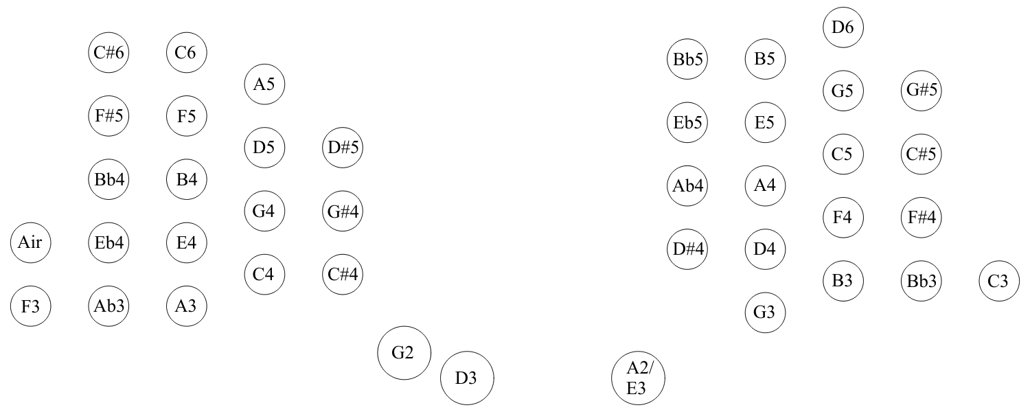
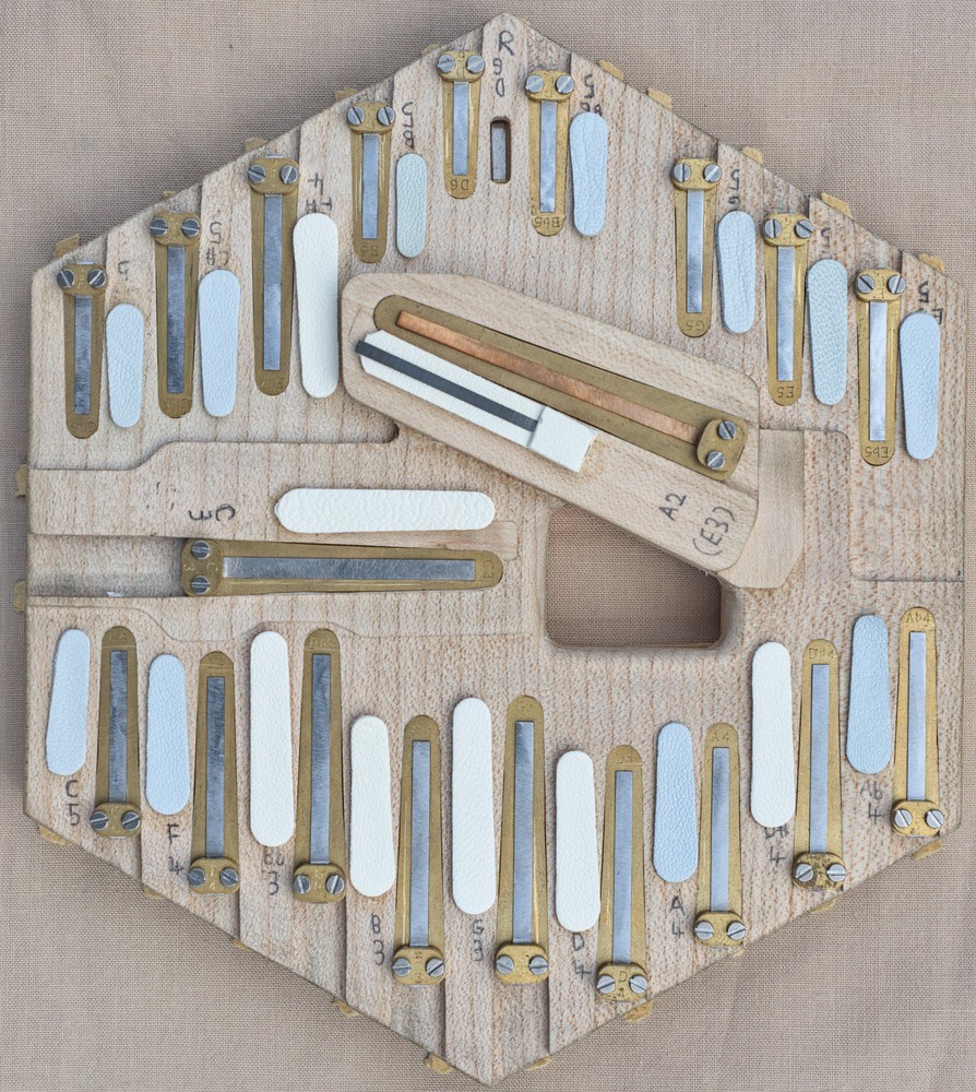
- 40 buttons: 18 treble + two bass buttons on the left, and 19 treble + 1 bass button on the right. Also has an air button on the left.
- Six sides, 6 1/3″ (161mm) wide.
- 5.7mm diameter nickel-silver capped buttons with domed profile.
- 3mm button height and 3mm button travel (buttons stop flush with end plate).
- 2:1 action lever ratio giving 6mm pad lift.
- Three bass drones operated by 10.6mm diameter flat topped nickel-silver capped thumb buttons.
- Brass reed frames with long scale steel tongues, except for the bass reeds which are extra-long and have phosphor-bronze tongues.
- Brass sheet riveted action levers.
- Full-width flat nickel silver end plates with crimped edges.
- Extra-fine hand cut fretwork with custom decorative elements and hand engraving.
- Dark red button bushing cloth.
- Black bog-oak thick-veneered action box sides.
- Solid bog-oak hand and thumb rests.
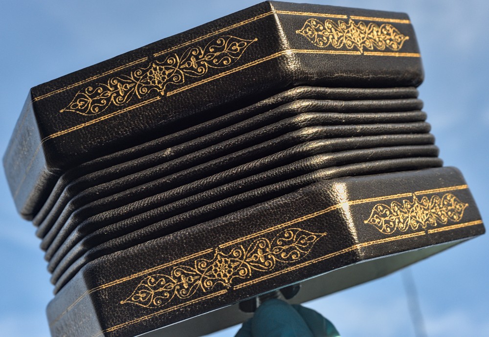
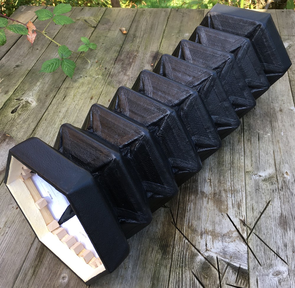
- Seven fold black goatskin leather bellows, fully leather covered.
- Real gold tooling on the bellows ends.
- French polished external woodwork.
- Hand engraved silver decorative inlays on the hand rests.
- Sycamore reed pans with parallel chambers and multiple chamber depths.
- Tuned Equal Temperament, A=440Hz.
- Weight: 1600g
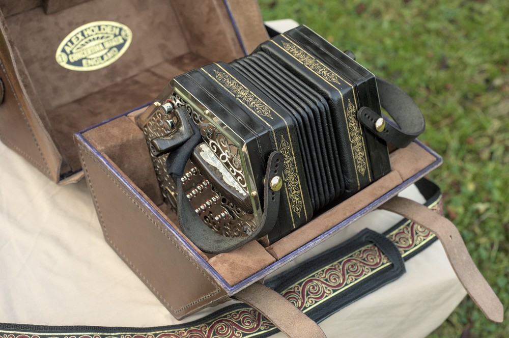
- Special hand made brown leather hexagonal hard case.
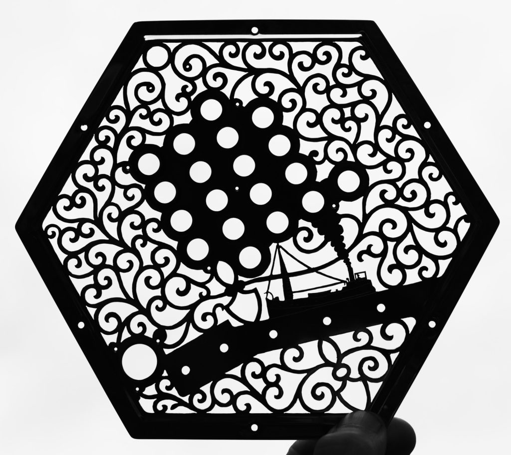
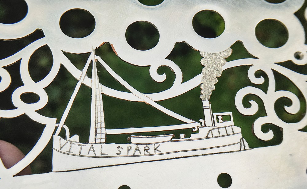
I built this instrument for a client who previously commissioned me to convert a Wheatstone English concertina to the Müller button and hand rest system by making new wooden-ended action boxes to fit the existing bellows and reed pans. He was (and still is) very pleased with that instrument, but also wanted another one that is louder, brighter, and faster, and that also incorporates some extra low notes that aren’t present on a standard treble English donor instrument. I believe I succeeded in meeting those aims. We also increased the button size and moved the keyboards a bit for ergonomic reasons, and we went a bit overboard with the cosmetic design. The fretwork incorporates an image of the Vital Spark, a fictional Clyde Puffer cargo ship from a series of stories by Neil Munro, later adapted into various TV series featuring a character who plays a concertina.
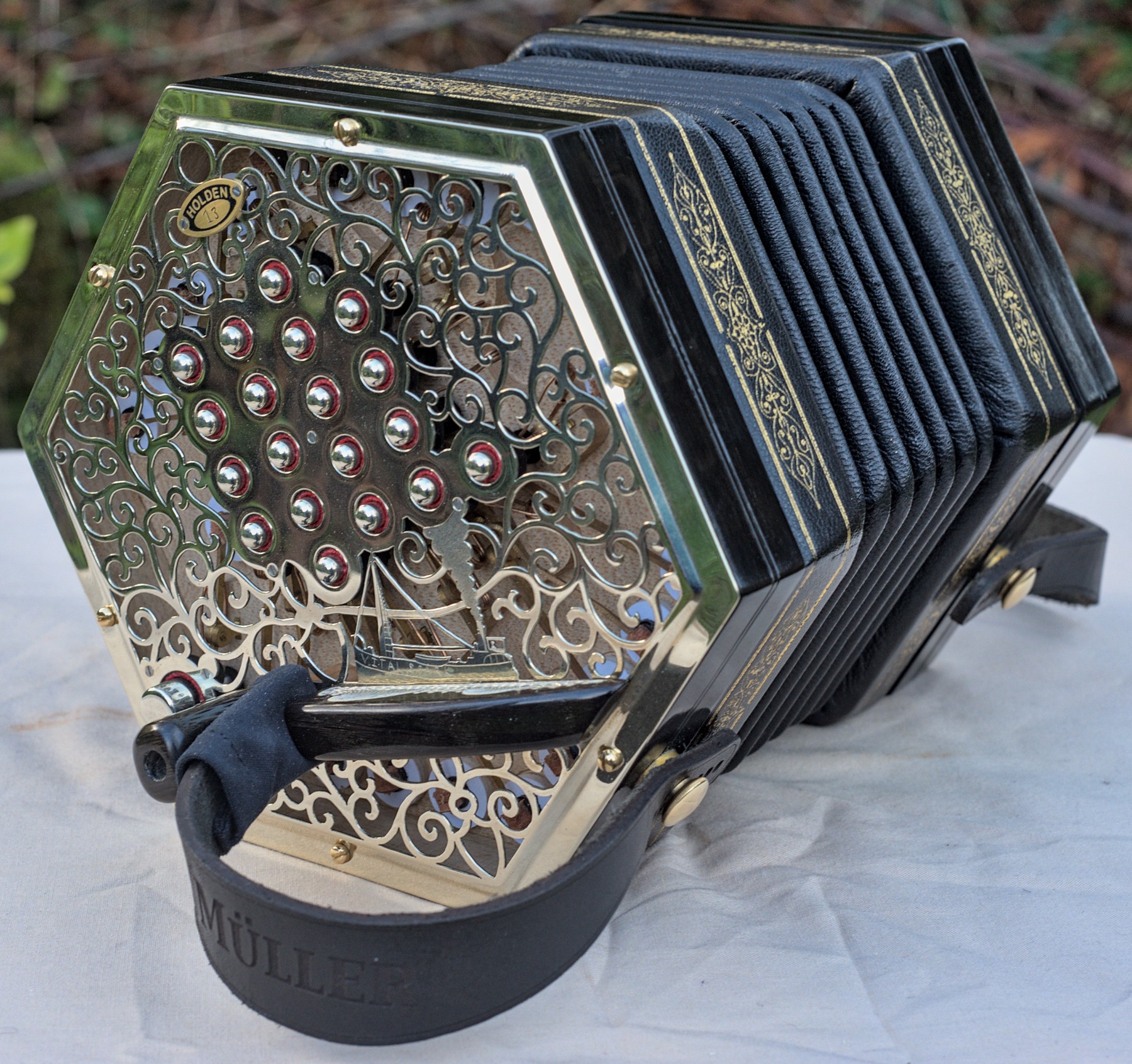
The core four rows of the button layout are arranged like a standard treble English, missing off the lowest G#, the highest Ab, and everything above D6 (the very high ‘dog whistle’ notes). We added a low F3 and a low C3 in outer row positions intended to be played with the pinky fingers (which are not used for holding the instrument on the Müller system). The reason we didn’t put them in the logical place for the English system is that they would have ended up very close to the hand rails, making them difficult to reach. We also added three special low drone buttons for playing with the thumbs. On the left hand it is possible to hold down both drone buttons (G2 and D3) at the same time. On the right hand, we had initially discussed including two drone buttons (A2 and E3) but there proved to be not enough space in the reed pan, so I instead made both pairs of reeds fit the same slots so it is possible to choose which note to have on that button by opening the instrument up and swapping them over. I believe my client said he is finding E3 more useful than A2 for the tunes he plays. Note that all the extra notes are on the logical side of the instrument for the English system. There is also an air button off to the side; it’s only used for silently opening and closing the bellows so it doesn’t need to occupy the Anglo-style right thumb position. It is tuned using Equal Temperament because my client plays in a wide range of different keys.
Demonstrations
Here are two videos of my client, Paul Connolly, playing the instrument. The first one is a bit tongue-in-cheek and was recorded in his living room immediately on delivery, before he had a chance to get used to the differences between his old and new instruments. The second one is a more serious recording in a studio after he had been playing it for a few months, and was intended to show how the drone buttons can be used.
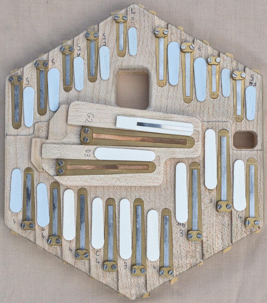
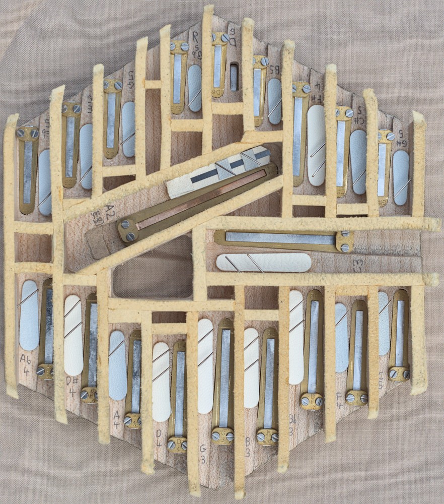
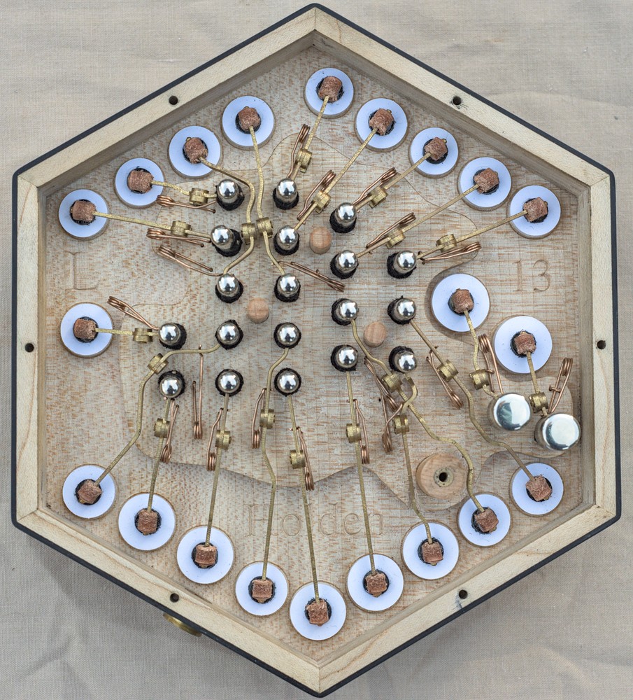
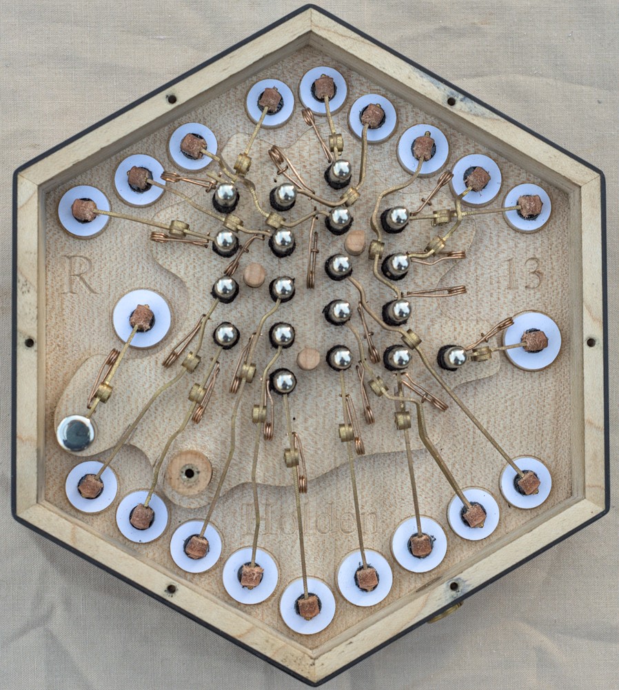
Reed Pans
The instrument has 20 notes on each side. The chambers for the melody buttons are on the outer edges of the pan and the larger chambers for the bass drone buttons are in the middle. The melody chambers are arranged in parallel rows for a more Anglo-like sound, however there is a slight issue with chamber depths. On an Anglo, the lower notes are on the left hand and the higher notes are on the right hand, so I make the left hand reed pan a couple of mm deeper than the right hand reed pan. On an English, both hands have low notes at one end of the keyboard and high notes at the other end. The way I got around this is by putting the low chambers in one row and the high chambers in the other row, and making the rows two different depths. This required me to start with a thicker-than-usual reed pan board and route a step on the bottom side. The chamber for the lowest melody button (C3: the same as the lowest note on a treble C/G Anglo) comes in from one side of the right pan and is on a third level that makes it slightly deeper than the bottom row. The bass drone chambers are deeper still. To make the drone chambers work I had to glue extra platforms of wood to the bottom of the board. Creating the CAM program to machine them at several different depths was rather complicated and more time consuming than a normal reed pan where everything is at the same depth and any tapering is done by machining the tops of the walls to a wedge shape. Fixturing was slightly trickier too. If you look closely you may spot where I made a small mistake on both pans and had to glue on some handmade patches to correct it.
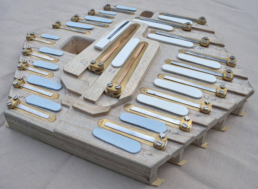
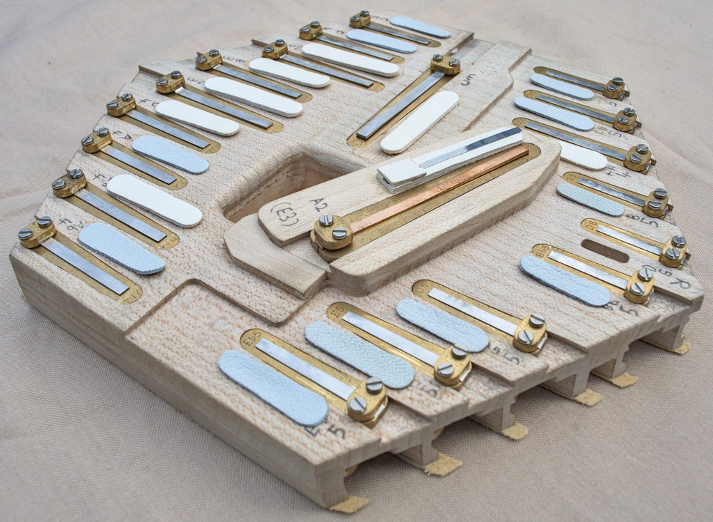
This was the first set of reed pans I made where the inner reeds are in dovetail slots rather than screwed down. I found that worked worked quite well, is significantly easier to tune, and possibly sounds a little better (I sometimes felt I could hear a slight buzz from screwed-down reed frames). The disadvantage is the chambers have to be slightly longer to allow space to pull the reed back before you can lift it out. That doesn’t really matter for bass chambers where they benefit from being significantly longer than the reed anyway.
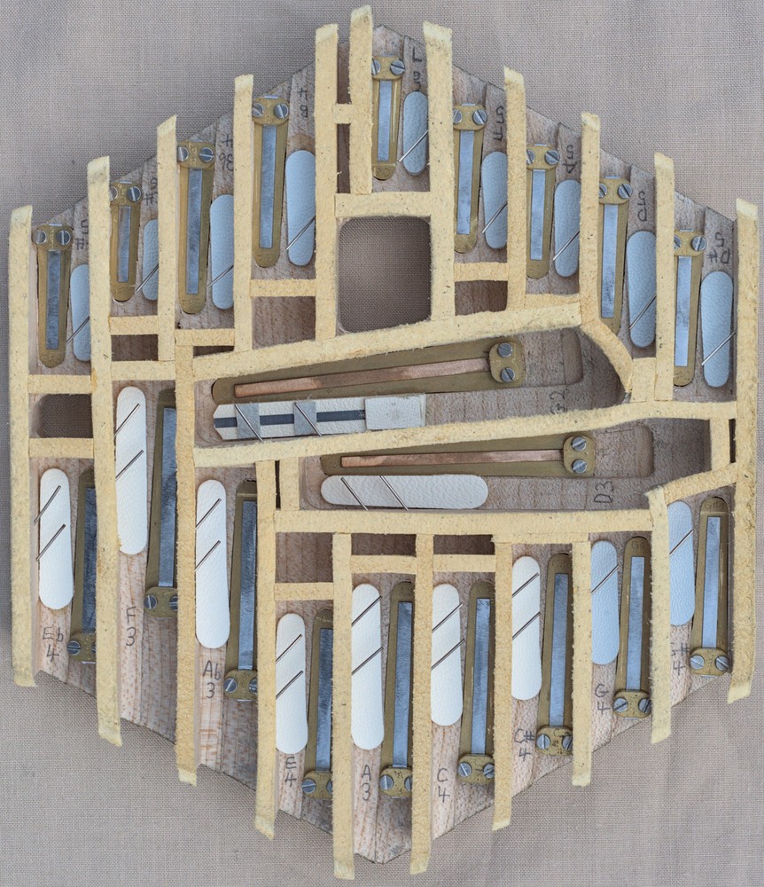
Another unusual thing about this instrument is the bass drone reeds. As an experiment I made them from phosphor bronze instead of spring steel in the hope they would have a mellower tone (I’m not sure if that had any effect: they sound like steel reeds to me), I made them longer than my normal long scale without heavy tip weights so they respond quickly and don’t have a lot of pitch bend (I believe that was successful), and I gave them a narrower aspect ratio in the hope of making them sound a bit quieter than the melody reeds (I’m not sure how successful that was: they are only slightly quieter, and the long narrow tongues were more difficult to make and fit). The phosphor bronze was quite nice to work with: it’s certainly a lot easier to cut and file than the hard spring steel I normally use. In theory it shouldn’t be prone to failure due to work-hardening as sometimes happens with brass reeds.
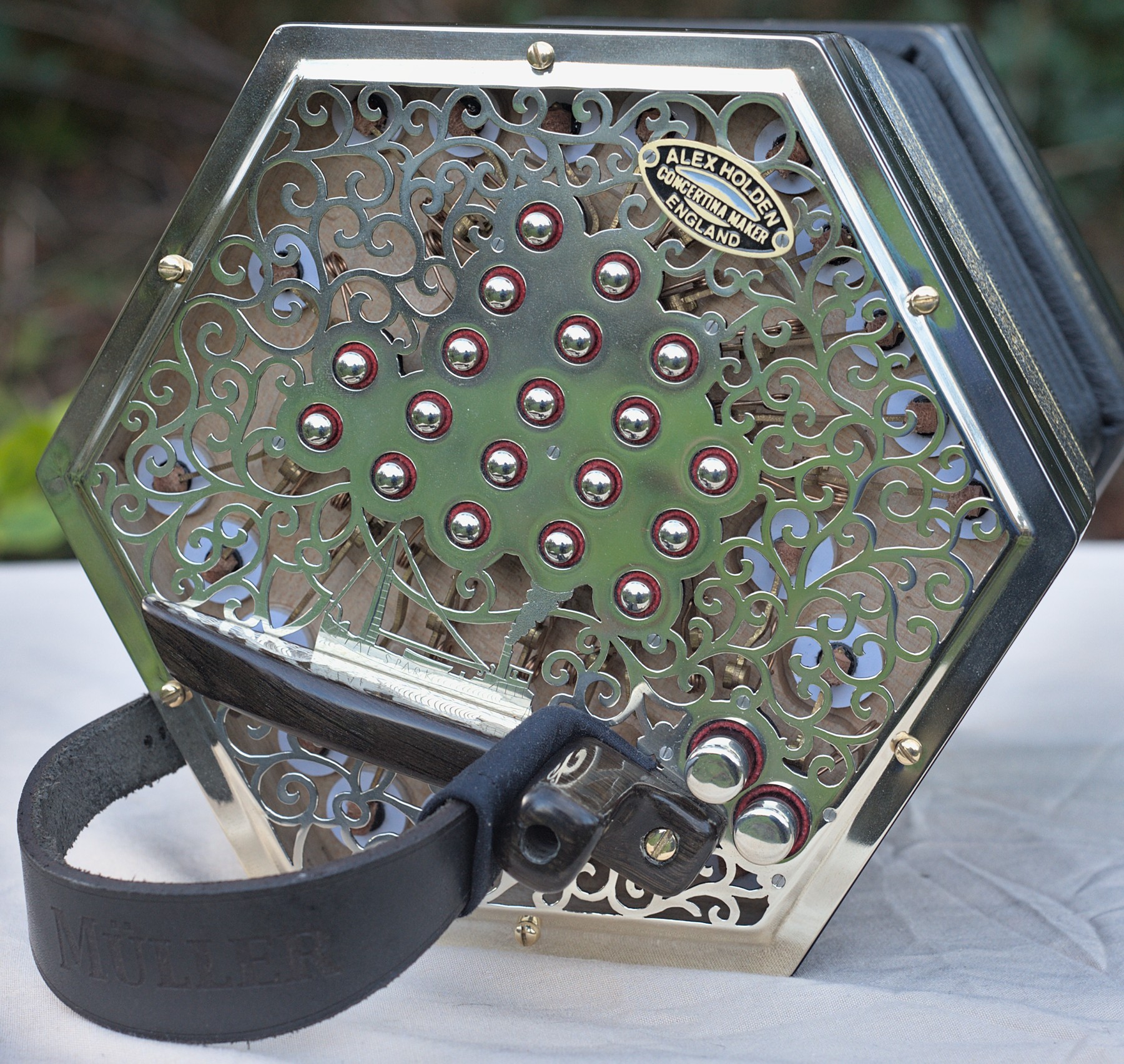
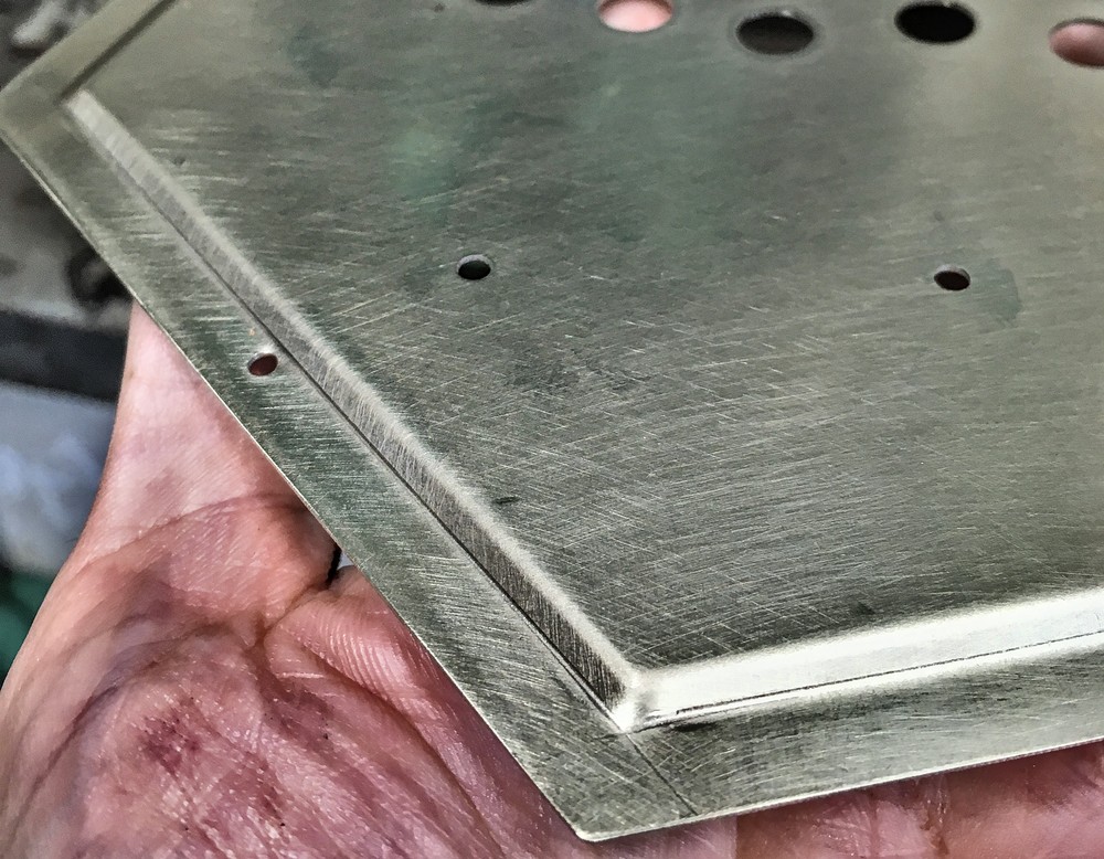
End Plates
It has flat nickel silver end plates with crimped borders. I made a slight modification to my crimping tool that gave me a crisper edge than on previous end plates.
This was probably the finest traditional pattern I have designed and cut so far.
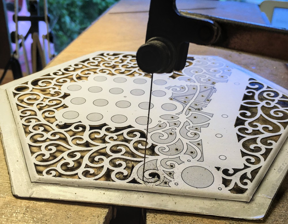
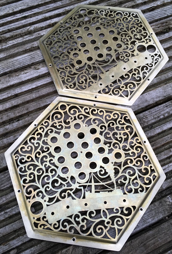
The end plates incorporate hand-engraved images of the fictional Vital Spark steam puffer, which has some personal significance to my client. Incidentally the tall triangular structure is a steam powered crane that was used to load and unload cargo, as these ships often had to deliver goods to small ports around the coast and small islands of Scotland that didn’t have much dockside infrastructure. The small object on deck near the boat is meant to be a barrel of whisky (“a drop o’ the real stuff”). The smoke from the funnel was textured using a special faceted punch that makes it reflect light in interesting ways.
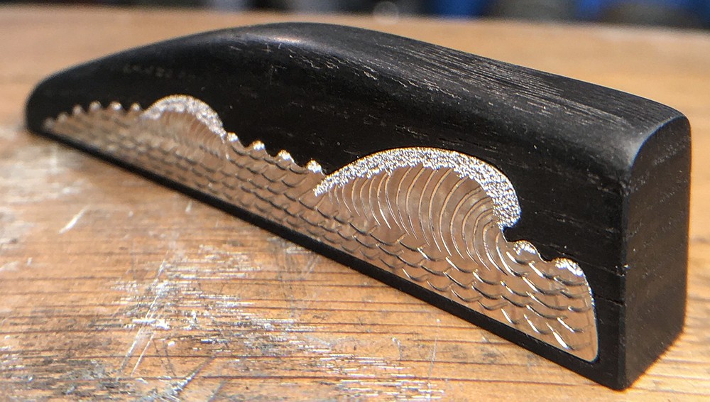
The hand rests were made from Ukrainian bog oak, with hand-engraved fine silver inlays meant to represent ocean waves. The silver blanks were cut by hand, but the inlay rebates in the wood were CNC-routed with a little manual adjustment with a scalpel.
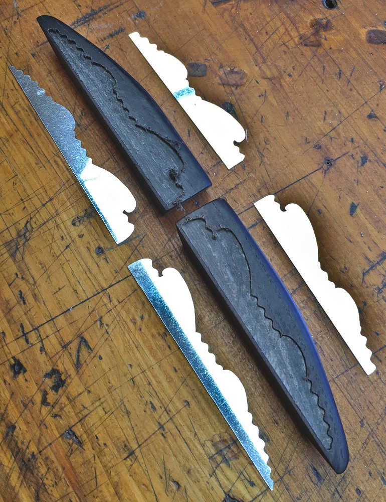
I chose to make the inlays from fine silver (.999) rather than Sterling (.925) because it is much less prone to tarnishing, and we don’t need the extra hardness of Sterling in this application.
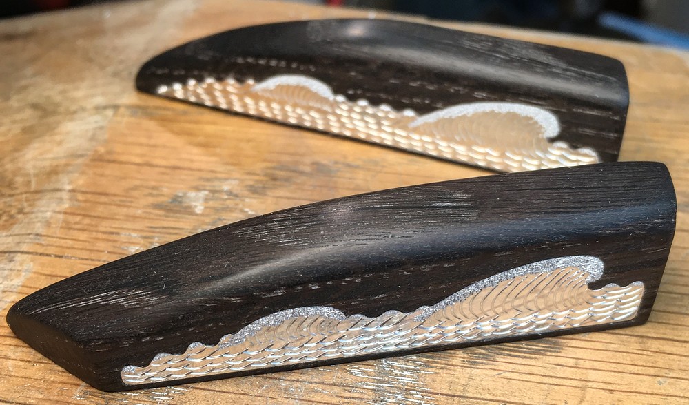
You can again see the effect of the texturing punch representing the white foamy water on top of the waves.
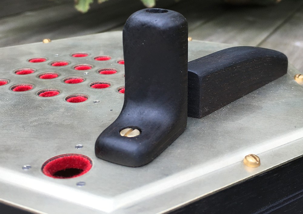
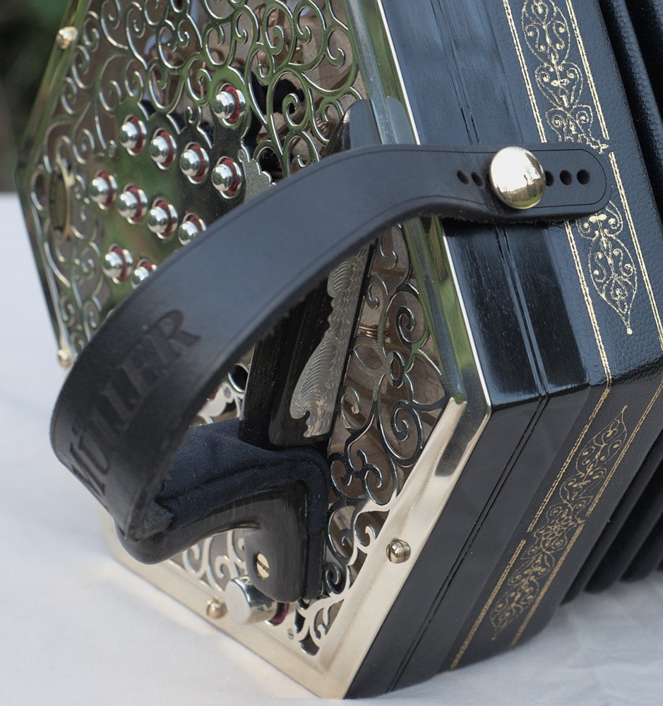
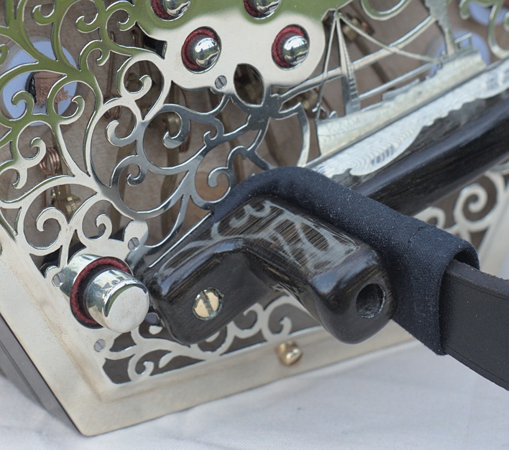
I made some experimental boot-shaped thumb grips/strap clamps. The idea was that they would allow you to grip and control the instrument a bit more firmly than simply gripping the strap.
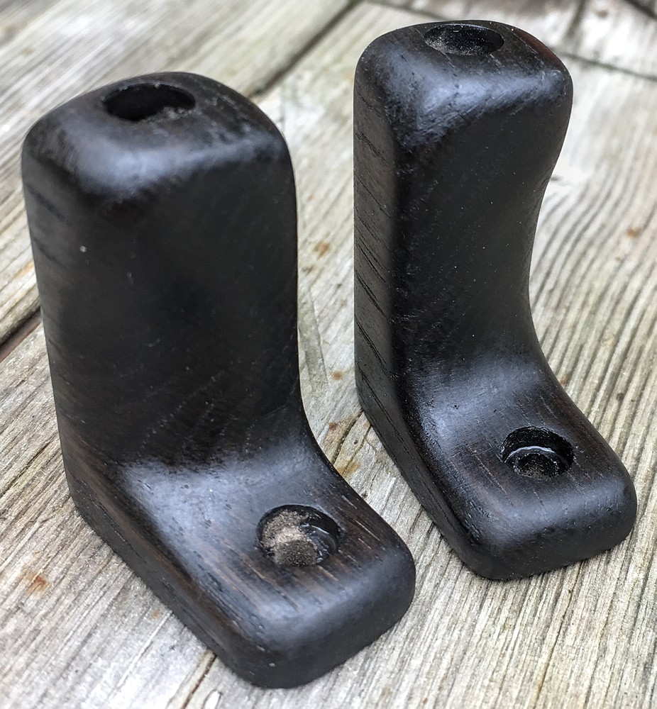
The black cloth “sock” on the end of the strap is there to stop the strap creaking when it rubs against the wooden thumb grip.
In case the idea didn’t work out as intended, I also made a pair of more conventional thumb rests.
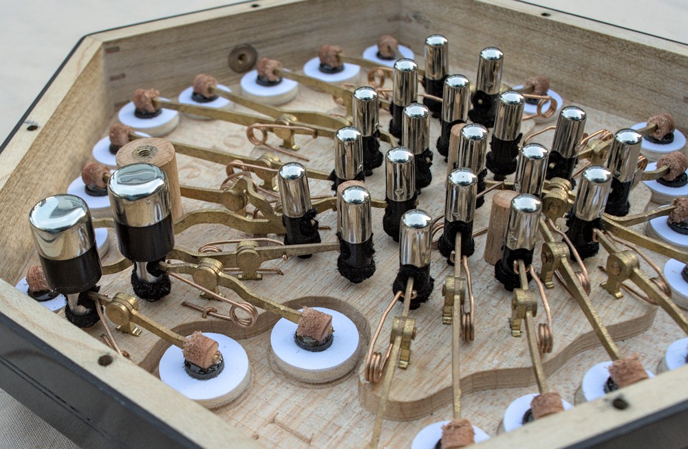
Action Boxes
I also veneered the sides of the action boxes with bog oak. Because I started with blocks of solid wood, I resawed and drum-sanded it to about 1.5mm thickness; more than twice as thick as commercial sliced veneer (which is typically only 0.6mm when supplied, reduced to 0.4mm or less after gluing it on and sanding it smooth). This is more like the sort of thickness of veneer you see on better quality Victorian instruments.
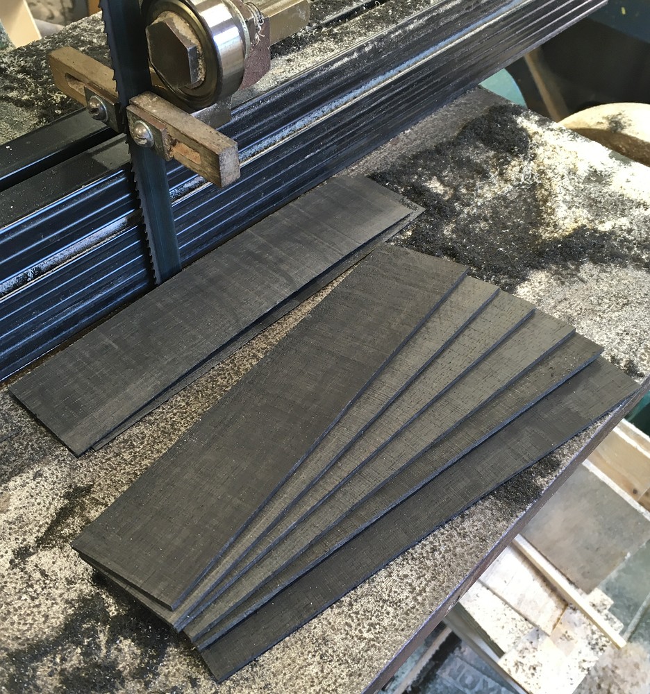
Black bog oak has a relatively coarse grain and interesting pores. In some places you can also see medullary rays, though they are less visible than on white oak. The extra thickness of the veneer allowed me to safely round off the corners a bit more than is possible with a thin modern veneer.
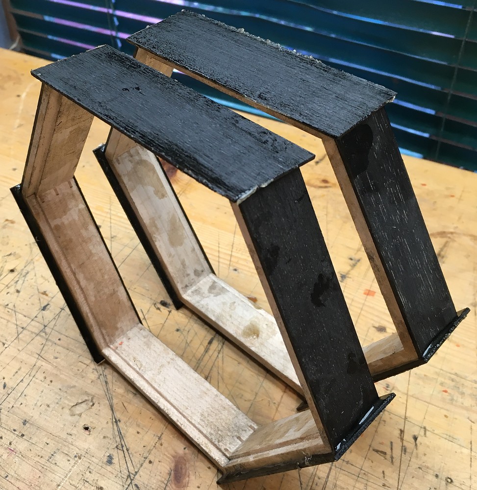
You can also see the thickness of the veneer in this picture. The actions were a little fiddly to assemble in a few places but not too bad.
The button tops were deliberately more domed than I usually make them, at Henrik Müller’s suggestion.
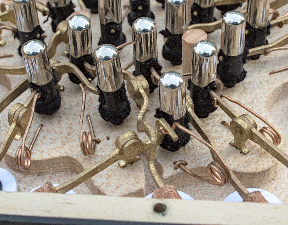
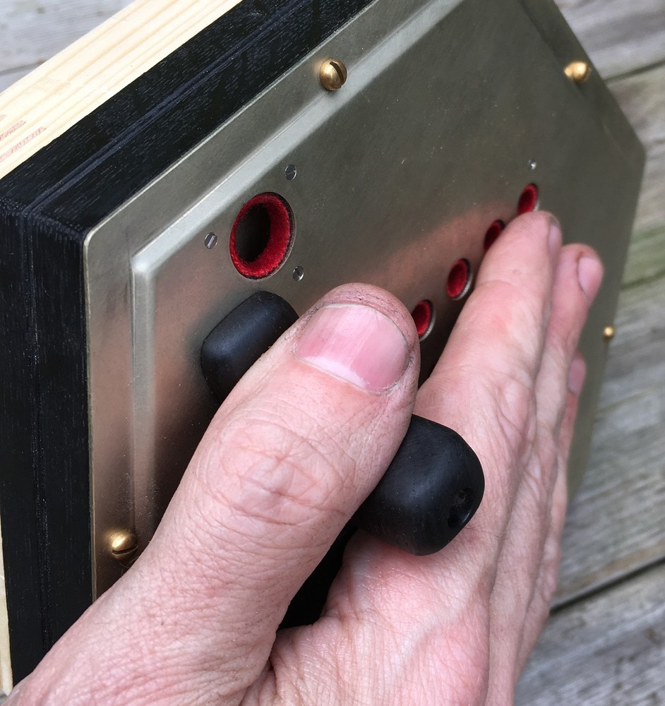
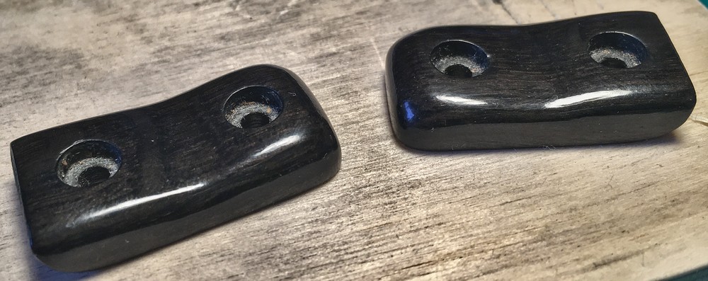
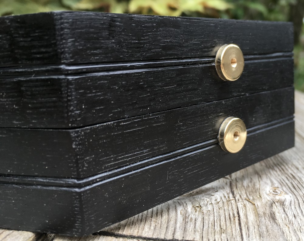
A new feature was the extra-large thumb buttons. The large nickel silver cap is in fact an earlier stage in the normal cap-pressing process (I start with a flat disc and press it through several progressively smaller dies, reducing the diameter of the cap at each stage). The black portion below the cap is made from bog oak, and the central core is aluminium. The two buttons on the left hand were deliberately placed close enough together to make it easy to press both buttons if desired (the two notes are G and D).
The main flaw with the large thumb buttons is that it is quite easy to tap them accidentally, and the instrument is so light and responsive that the notes sound instantly at the slightest touch.
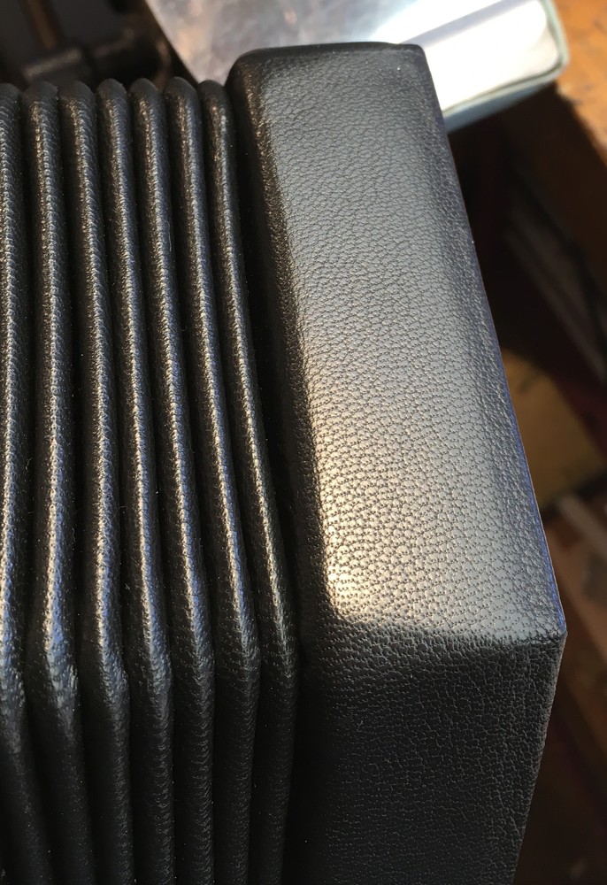
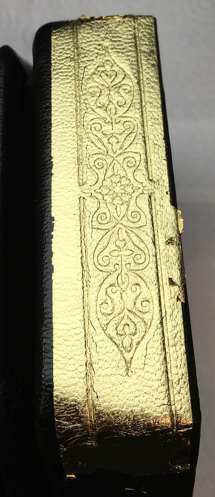
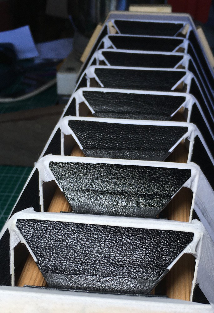
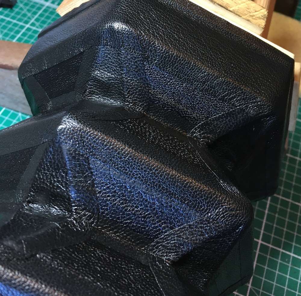
Bellows
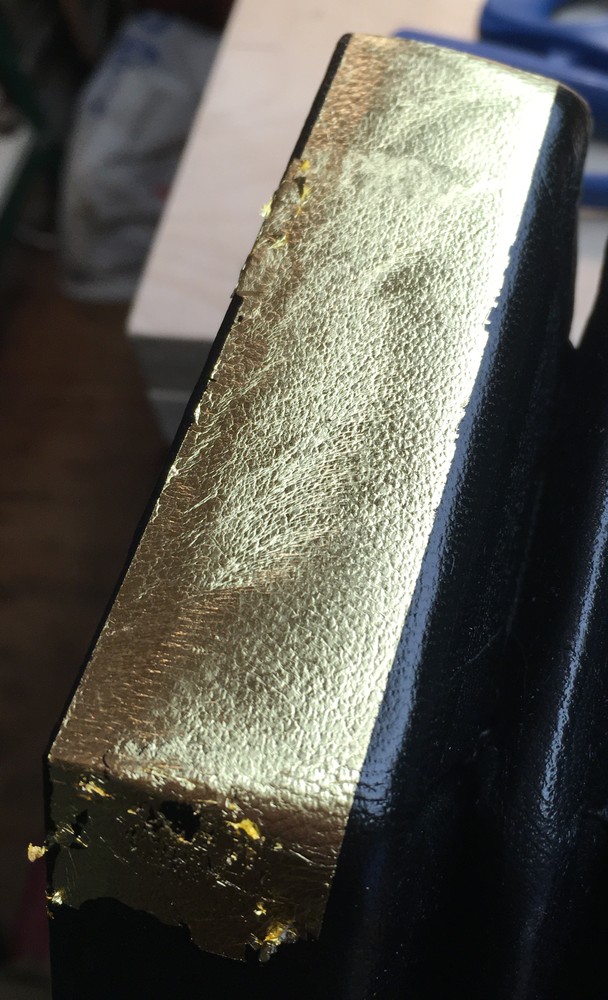
Another new feature of this instrument was gold tooling on the bellows end runs. I have actually previously made a set of bellows with the traditional Jeffries pattern, but I wasn’t totally happy with the results. This time I designed my own pattern, made new tools and jigs, and learned the traditional bookbinder’s method of gold tooling with real gold leaf. I’m pretty happy with how it turned out. There is something about the colour of actual gold leaf that looks much nicer to me than modern hot foil.
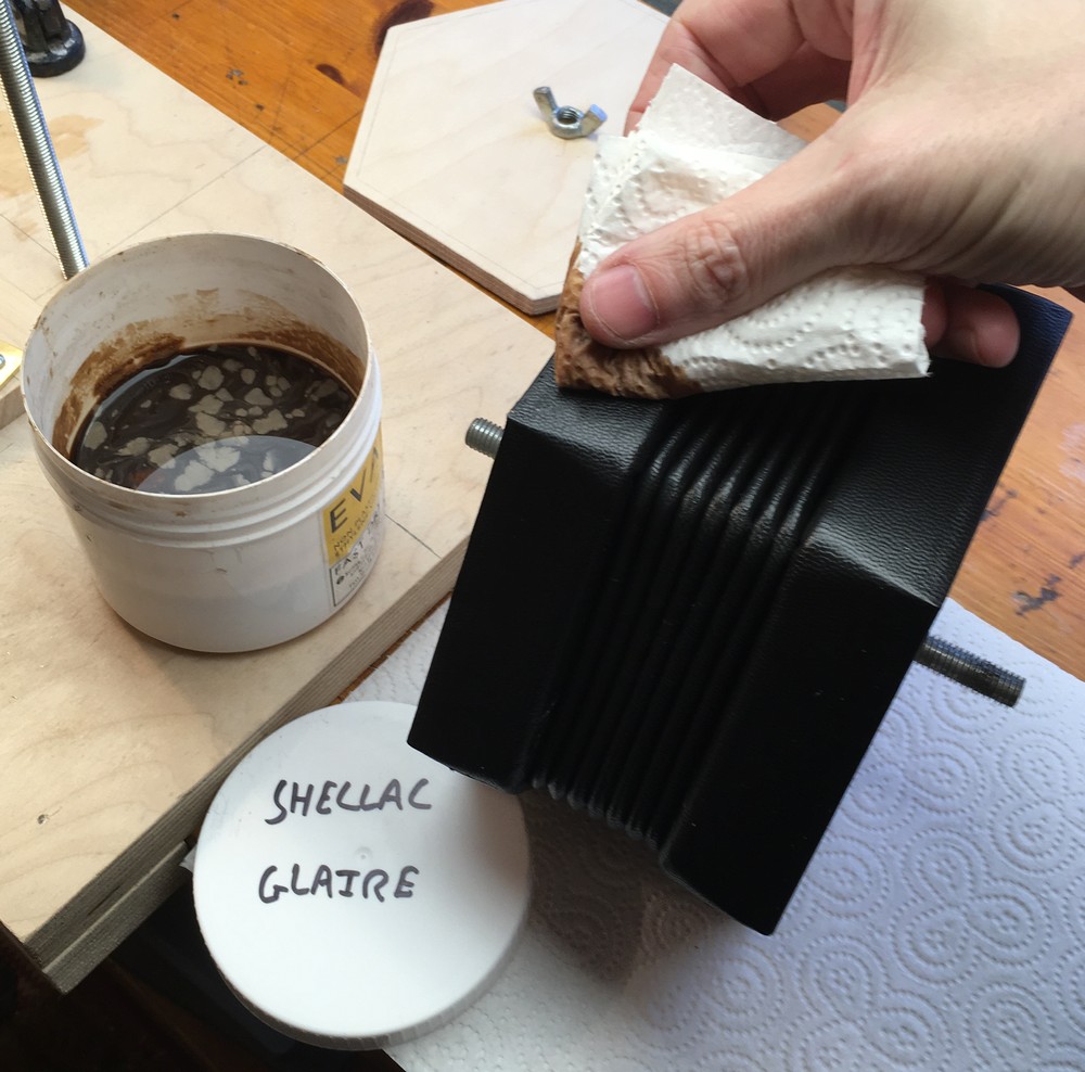
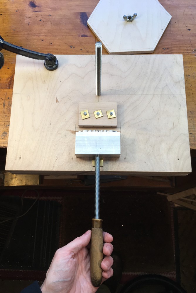
I milled the new stamps from aluminium because it was cheaper and less time-consuming than making them from brass, and I figure since I’m only pressing them onto soft leather they aren’t likely to wear out very quickly. There are two stamps. The first stamp makes a double line with a cutout in the middle, then you flip it over and it makes the same thing again with a space between the lines. I also have a technique for rolling it around the rounded corners of the frame because if you just applied it straight-on you would get gaps in the corners.
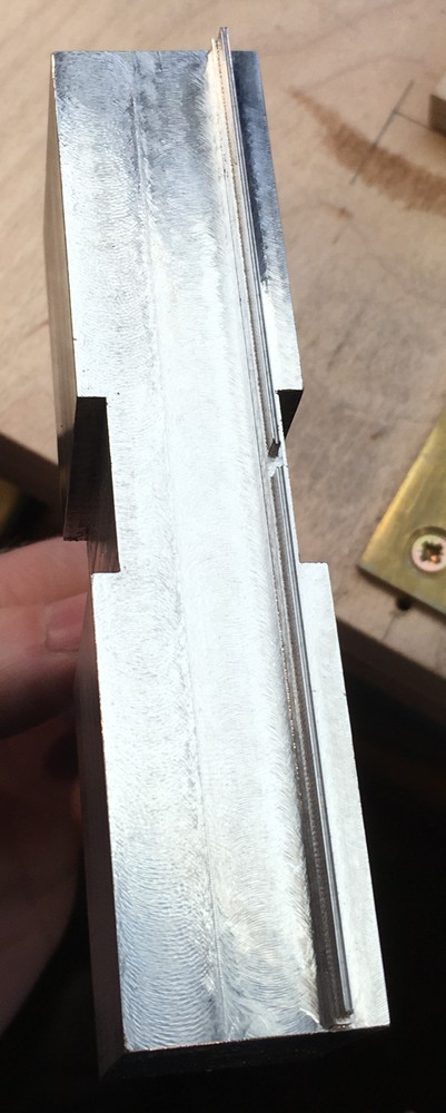
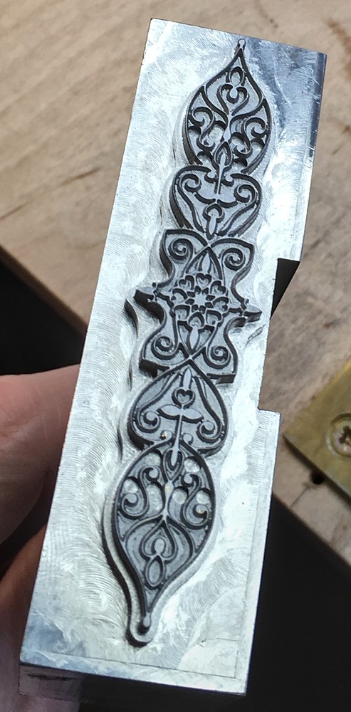
The second stamp makes the pattern between the lines. This is quite a fine pattern, more so than most of the other gold tooling designs I could find pictures of. By dividing the stamping into three operations I have more options to tweak the spacing or replace an aspect of the pattern, and also it’s easier to get a full impression if each stamp doesn’t cover too much area.
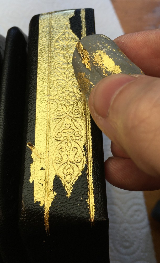
The first step is to use a hot iron to smooth the leather as best I can. The coarse grain of the goatskin I use makes it difficult to get a clean impression.
Next I apply a shellac glaire, which is 30g of button shellac and 10g of borax dissolved in 200ml of hot water. This acts as a sort of heat-activated glue to stick the gold leaf to the stamped areas of the leather.
A tiny amount of Vaseline (petroleum jelly) rubbed onto the leather helps the gold leaf to stick.
I used a paper-backed roll of gold leaf as it was easier for me to work with than individual leaves.
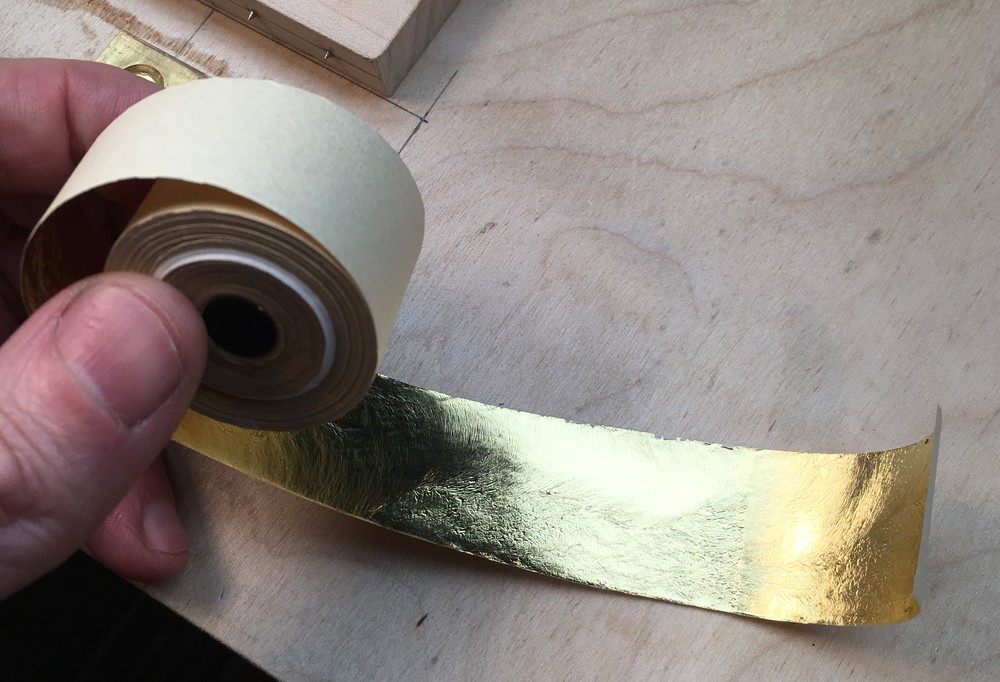
The gold leaf is ridiculously thin.
I heated the stamps to 130C on an electric hotplate.
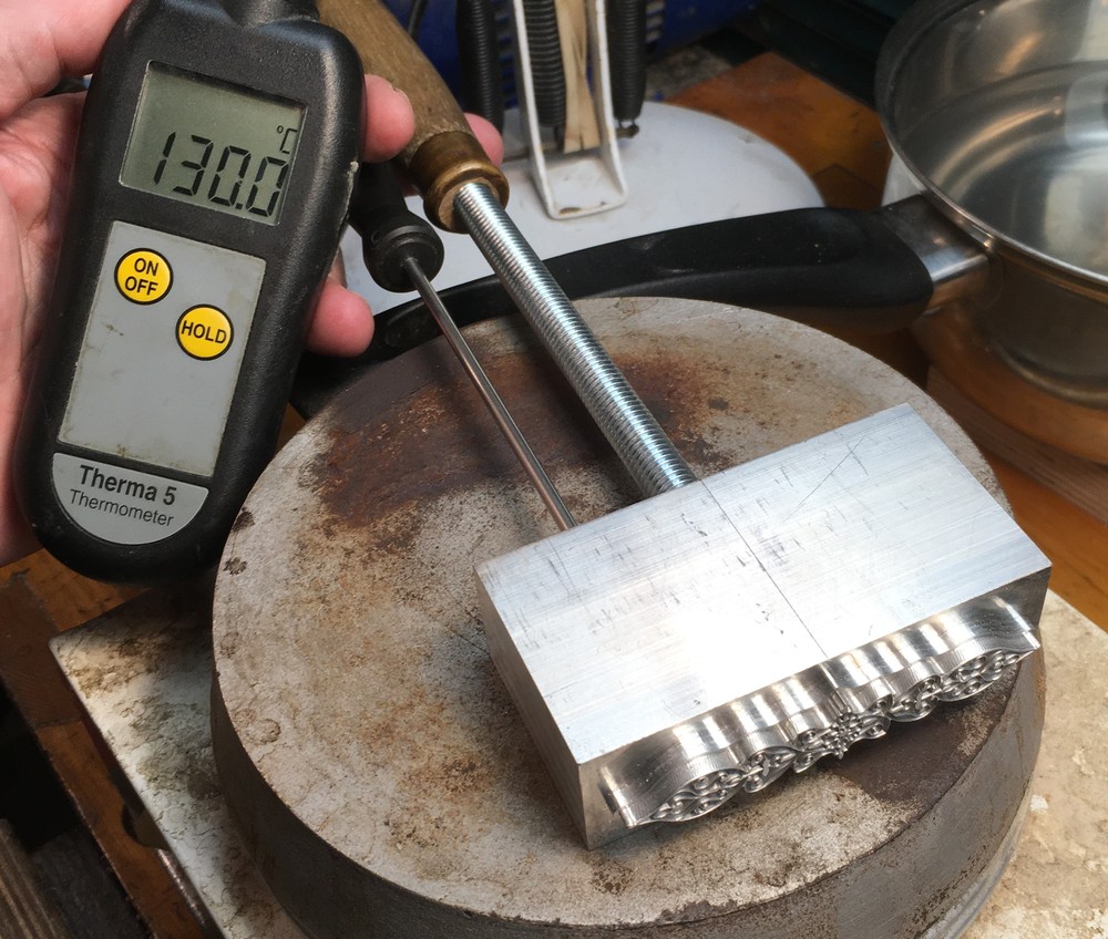
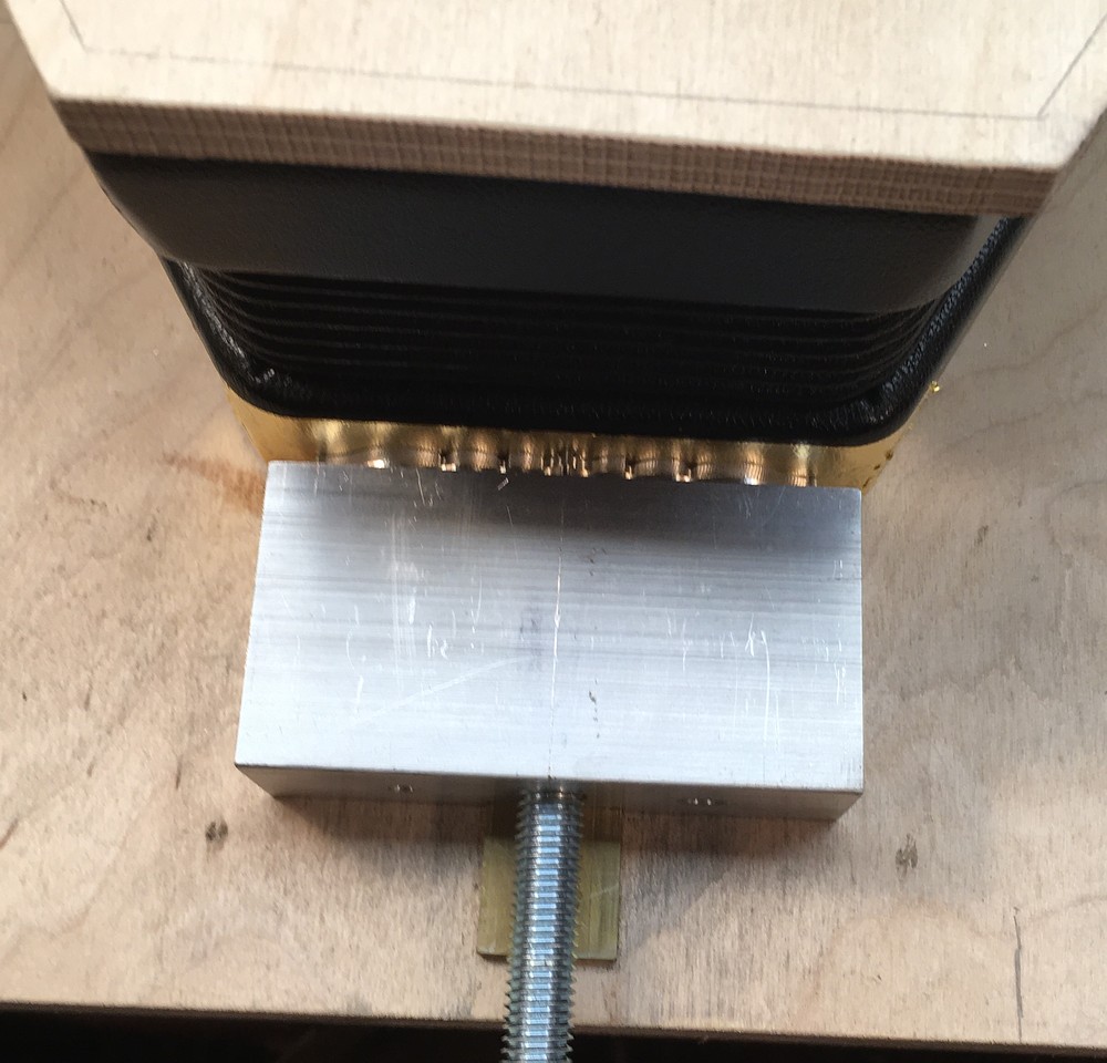
Then I used my special fixture to stamp one side at a time, both the pattern and both pairs of lines.
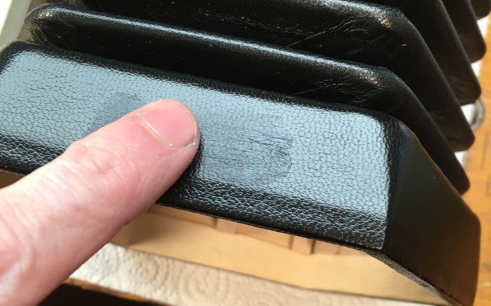
At this point the background has gold that is lightly stuck to it with Vaseline, and the lines/pattern has gold that is more firmly stuck to it with the shellac glaire, which was activated by the hot stamp. We have to remove the background gold and leave the design behind. After a lot of experimentation, I found the best way to do it was by gently patting it with an artist’s putty rubber, periodically kneading the rubber to expose a fresh surface. Even so you tend to get a lot of little flakes of gold stuck in the pores of the leather that are difficult to remove, and if you aren’t very careful it’s easy to overdo it and pull out some of the stamped areas too. This is easily the trickiest and most time-consuming stage of the process.
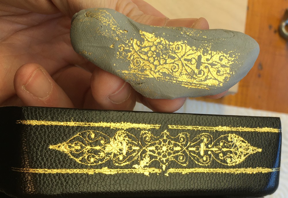
Then repeat for the other eleven sides. It is possible to clean off and redo areas if they go badly wrong, unlike with the hot foil process where you pretty much only get one attempt. The final step was to wipe a couple of coats of clear Resolene varnish on top to help seal the gold in and give it some protection (this has the side effect of also making the leather look a little glossier).
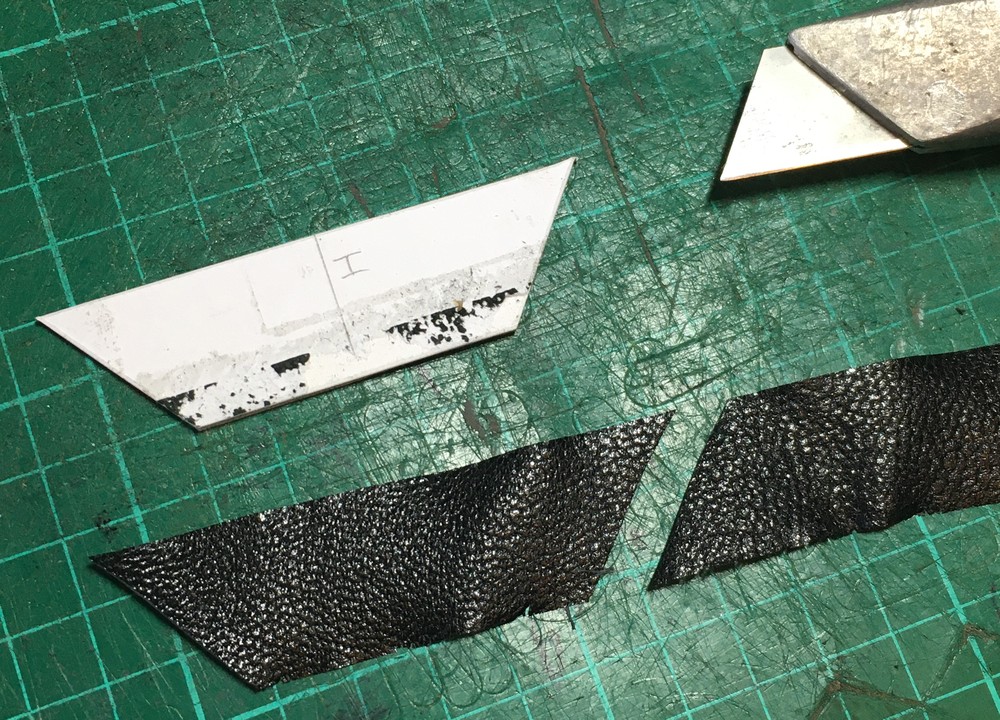
Another new feature of these bellows is that they are fully leather-covered; in other words they have real leather panels covering the middle of each card instead of either printed paper or imitation leather paper. The way I chose to do this was to cut strips of leather that are slightly less wide than the card depth, split them very thin on my Fortuna bell skiving machine, cut the strips into individual trapezoids, and glue them on over the valley hinge but beneath the gussets and top runs. This is different from the usual sequence where the papers go on last. The main reason I didn’t cut large leather butterfly shapes that cover each pair of cards instead of a hinge strip and two trapezoids is that they would have been much more difficult to split down to a suitable thickness. I could have glued the trapezoids on before the hinges, but I felt that would have resulted in a slightly weaker hinge.
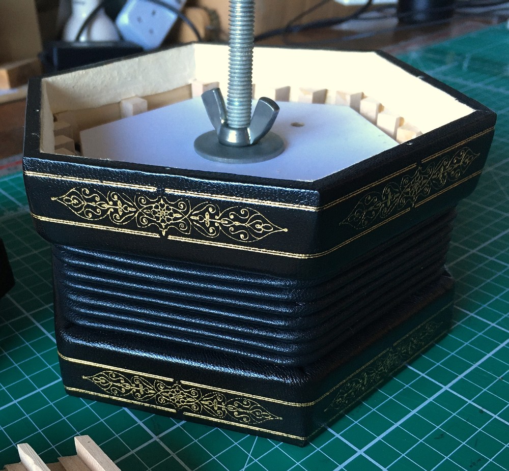
Case
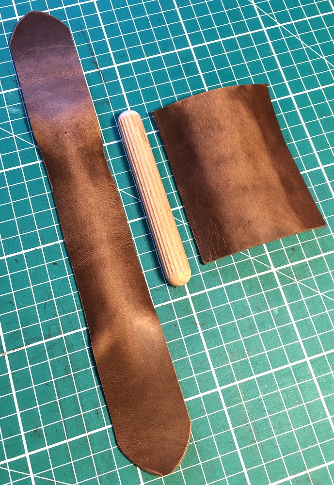
The case is a hexagonal leather-covered type similar to the one I made for No. 7, with a few cosmetic changes such as a different type of leather, aged brass buckles, different thread colour, and a different strap ribbon design with a suede shoulder pad. The internal blocking/padding is designed a bit differently too.
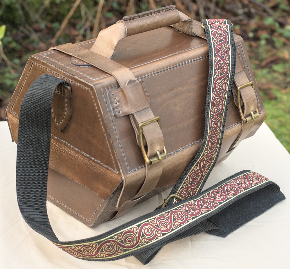
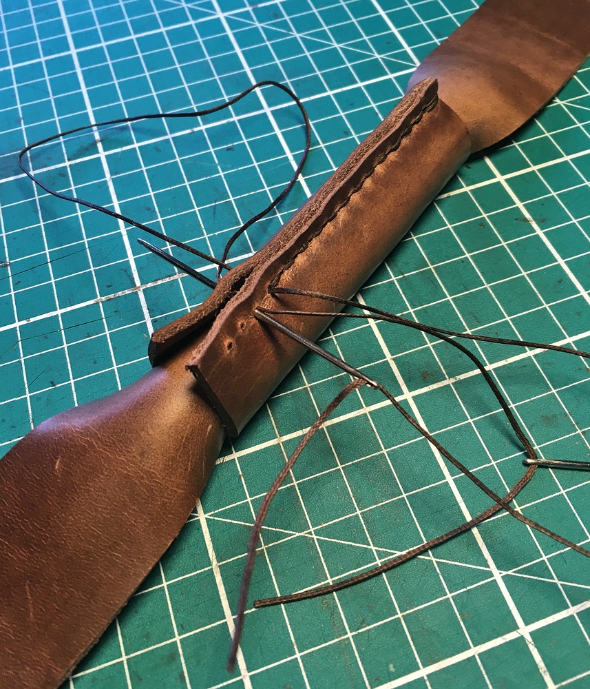
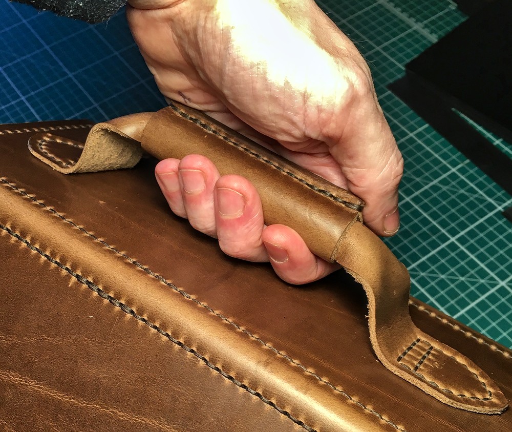
The main functional improvement with this case is a better handle design: the new pattern is made of two pieces of leather with the seam on top where it doesn’t dig into your fingers.